Case Study
Shirts By Mike
For this project I took on the redesign of an existing online t-shirt store called Shirts by Mike. Along with the redesign there was also a challenge of explaining the redesign process to stakeholders so that they might understand why these changes would take their site to a new level of effectiveness.

Problem
Critique and then redesign an existing website to better appeal to their target audience resulting in an increase in traffic and purchases for the site.
Audience
The target audience for Shirts By Mike is primarily age 16-35. They are Treehouse students who value being connected to that community. They’re drawn to a playful tone and also see themselves as lifelong learners. I started by creating a persona of a potential customer who represents this audience. From there we could start to make assumptions about what customers might be drawn to when visiting Shirts By Mike.


Wireframing
After doing a comparison of Shirts By Mike against some popular online t-shirt stores I began sketching some ideas for the site. Most obvious to me was the need to better capture visitors to the site with an appealing hero image and first impression. Stakeholders also expressed their desire to highlight a feature shirt so I added that to the homepage as well. I also wanted to make sure that it was clear what this site was about and so I included a welcome message. Then it was time to start wireframing off of the sketch ideas.


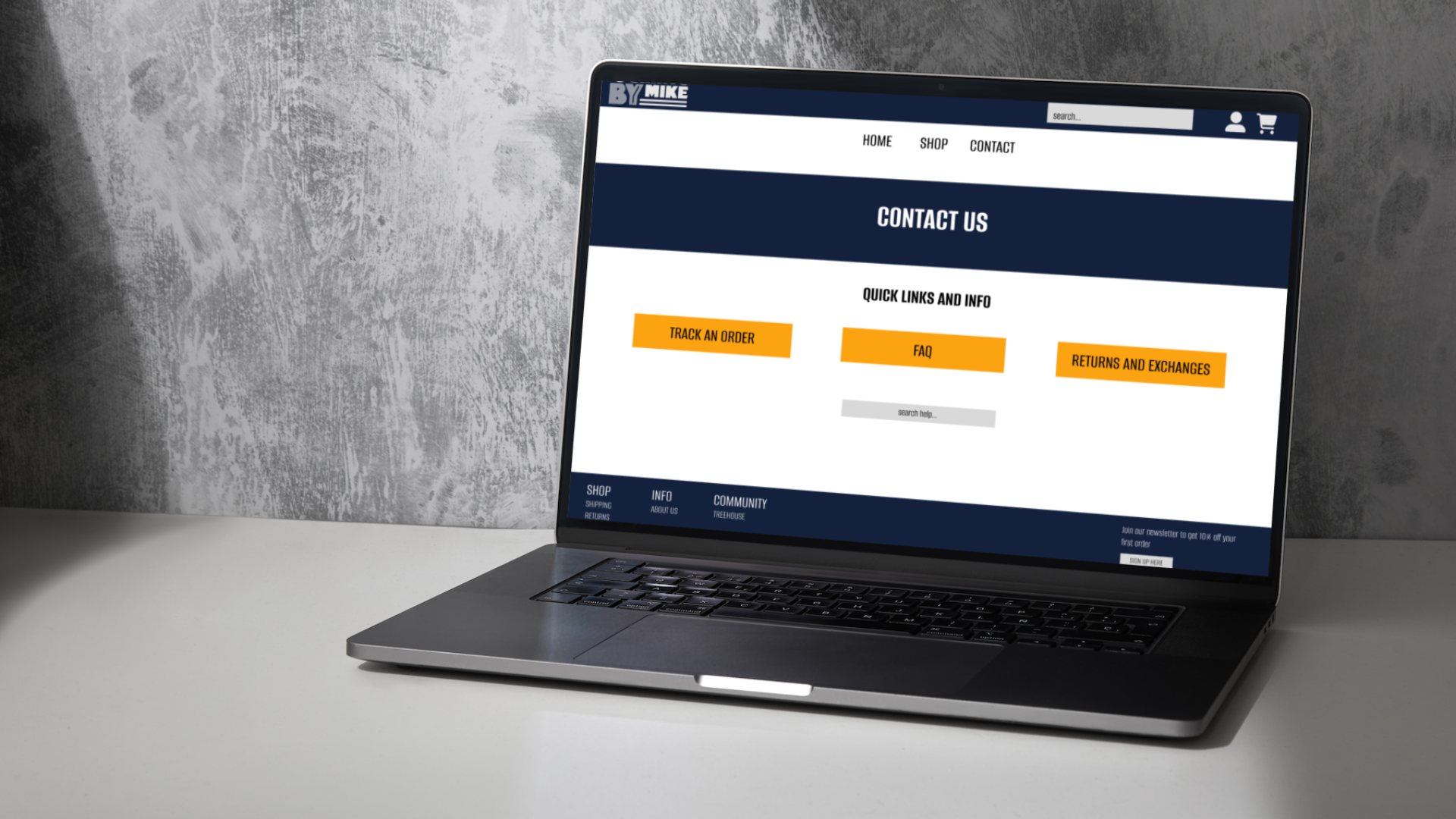
Solution
To bring the site to life I chose to soften the original colour scheme which was heavily orange. Because I chose to leave the branding alone I had to keep the orange but moved it to the background. The wireframe process helped me see that I still wanted to add another element to the homepage that would highlight our target audience value of community, so I added a prompt to connect on instagram. I also went with a simple font, the original fonts didn’t complement each other at all as is visible on the original catalog page. I gave the product page some clear info about the shirts and made it easy to choose colours. The site needed a footer that would allow visitors to navigate more effectively from anywhere on the site so I added that too. And finally, I added a contact page to allow customers to seek help while they shop.


Learnings
This project was a great opportunity to take something existing and make it better. I think the full vision of improving Shirts By Mike would include a branding and colour refresh and then bring those into a new website. If I could go back and make some improvements to my redesign I think I would choose a different font family and try out some different buttons for navigation. I would also soften the edges of some of the boxes. Overall I think I still improved on the original but I’d love the chance to work with some new branding if another redesign was an option.