Case Study
Whooshmail
My role for this project was to design and build a taskflow for imaginary email campaign website “WhooshMail”. The project included user research and testing, wireframing, mockups, and building a presentation for stakeholders.

Problem
Provide an email platform for businesses to use that is straight forward, stands out among other platforms, and is clear and easy to navigate for multiple user types so that they can communicate with customers effectively.
Audience
I started by creating two personas based on the target audience. One for the Admin level user, and one for the Basic level user. Based on our target audience I made some assumptions about what they would be looking for that helped direct the rest of the project. For example, I assumed that most users for both the Admin and Basic level still want a very easy and clear step by step process for building their email campaigns and that they would expect to easily find the editing tools to design and fill their email templates.


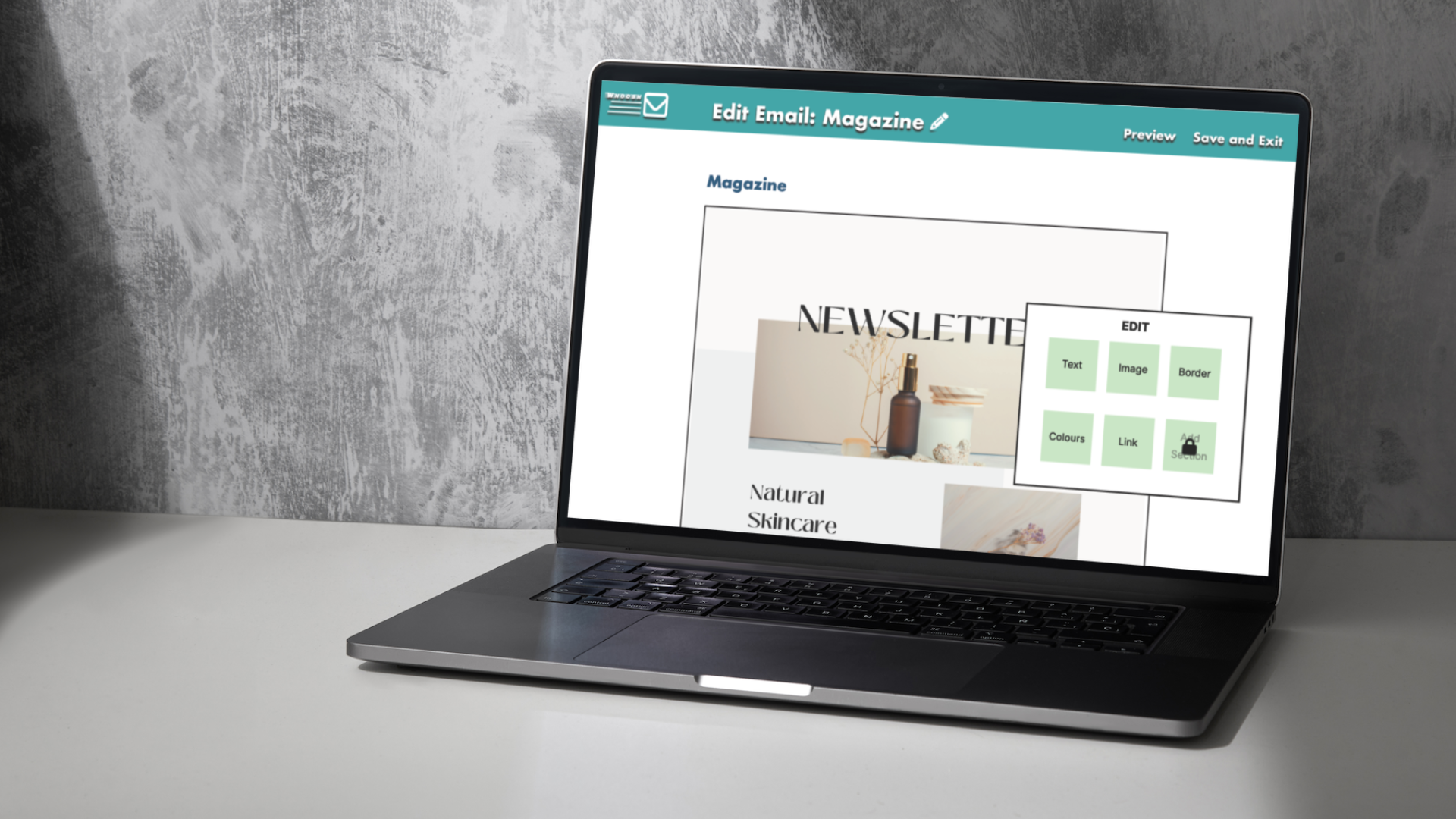
Wireframing
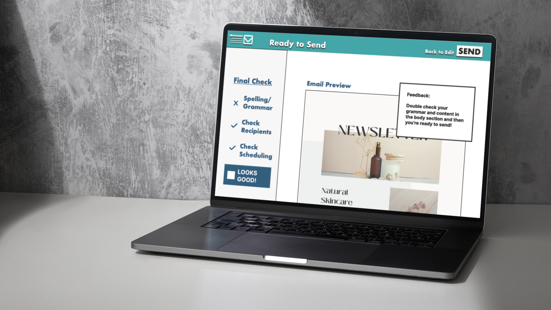
After doing some research into 3 popular email campaign platforms I began to wireframe some ideas for the new WhooshMail site. I wanted to give the site plenty of familiarity compared to the popular options that potential users might already come to expect. This helped me keep the purpose of each page and step very clear. At the end of wireframing I landed on 4 pages for this taskflow of selecting a template, designing, filling, and sending an email to a recipient group. Then it was time to test the prototype with my test group.


Test Results and Solution
Testing the taskflow prototype with a user group confirmed that my taskflow was clear and simple enough and that I could move on to Mockups. I took the feedback from the user tests to make the buttons and text that was most crucial to the taskflow stand out even more using colour and drop shadowing. My colour choice was influenced by our Admin persona who owned a plant shop so I chose a palette of green hues. I also used Canva.com to create a newsletter template to really help the final mockup look ready to go.


Learnings
This project ended with a presentation to the stakeholders of WhooshMail. My questions to them at the end of the presentation reflect my learnings. I think I would try a different colour palette and fonts next time. I have noticed that 90s pop is trendy right now and perhaps one of the ways to break into the email campaign platform for WhooshMail is to grab the newest users entering this target audience. I also learned that a larger user test group would be prefered just to make sure we’re getting the widest range of feedback available. I also think that the future is moving to more and more handheld devices for work and so what could this service look like completely redesigned for smartphone?
